 Marketing
The 6 Things A Business MUST Do When Translating…
By Giulia Ferraro
Are you on the cusp of translating your website into Japanese? Or perhaps you’ve already launched your sparkly new Japanese website – you’re proud to share this with Japanese customers and partners, proving your business is serious and ready to make a dent in the sizable Japanese market.
In the world of web design, there are many tips and tricks that we know to make our brand stand out, to communicate our product or service’s message effectively, and to ensure the viewer finds the most important information that can lead to conversions as efficiently as possible. But the question that Tokyoesque asks is this: When you set about translating your website into Japanese, are you translating it with the Japanese market and audience in mind?
Let’s take a look at the 6 things you must do to effectively translate your website into Japanese in order to maximise your ROI and grow your business in the Japanese market.
A website is a form of communication that businesses may be putting thousands of hours (and dollars) into. We also pay a good deal of attention to SEO optimization. How much of that time are we spending ensuring that every product or service that we’ve put so much of our labour into resonates with a Japanese consumer, too?
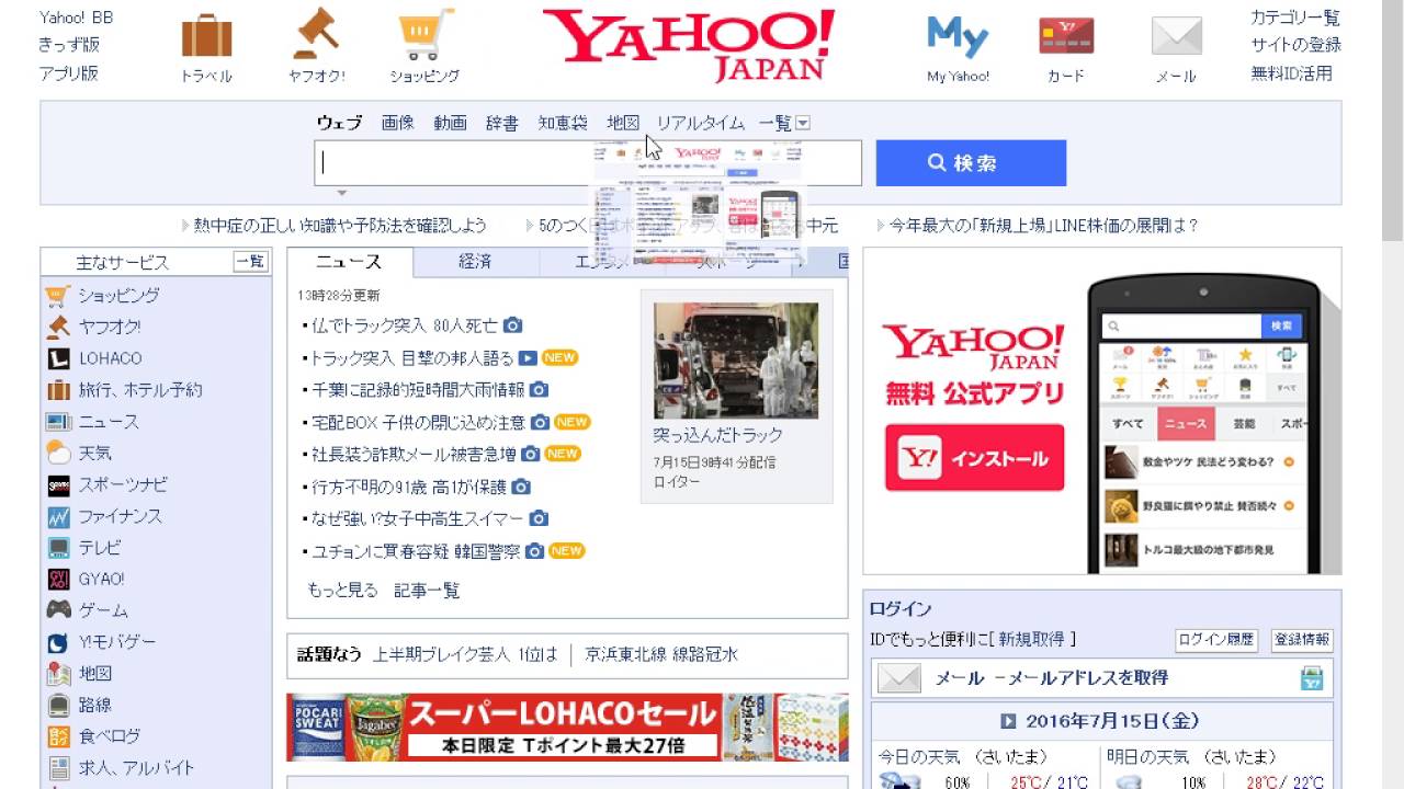
Japan has a unique design and communication style when it comes to websites. With a culture steeped in minimalism, some might expect Japan to take the ‘minimalist’ approach when it comes to website design – yet this is far from the case. Japanese websites are typically more visually stimulating than their Western counterparts (something an English speaker might easily call messy or cluttered). As just one example, Yahoo! Japan is the second most popular search engine in Japan, and interestingly, its design could not be any more different compared to Google. Whilst Google is famous for its simplicity, from a Western viewpoint, Yahoo! Japan is busy, bursting with information, graphics and colours:
As for communication style, Japanese websites usually strike the right balance between polite and friendly. In Japan, businesses are expected to speak in the polite-form when speaking to their customers, and whilst more serious industries (such as medical and pharmaceutical) would undoubtedly maintain a very professional and polite facade on their websites, more creative industries (such as beauty and gaming) may choose a more playful communication style on their websites.
Different industries, therefore, use different communication styles and tones when addressing their customers. There are a staggering number of choices of tone available to you when translating your website into Japanese, all due to the wide variety of ways to communicate politeness and casualness in the Japanese language. This is simply because of how different the Japanese language is compared to English.
If your company is thinking about translating your website into Japanese, you need to do it right: you don’t want to alienate your customer – instead, you want to draw them in with just the right tone of voice, look-and-feel and way of communicating.
So, here are Tokyoesque’s Top 6 Must-Dos for your business to consider when translating your website into Japanese.
Need help with translating your website or credentials into Japanese? Contact Tokyoesque.
1. Help Them Help Themselves
We have all heard about the exactingly high level of hospitality in the Japanese market. What our clients do not often realise is that this also extends to the world of website design. Our clients usually tell us that they don’t think they need to change their online customer service model for Japan. The problem with this line of thinking is that – as we know – Japanese customer service is completely different to the West; and in fact, it is incredibly important to take into consideration the hospitality with which we treat our customers – even on our websites!
In Japan, there is a proverb that says that the ‘customers are gods’, and this line of thinking is ingrained in the culture. Japanese consumers are used to excellent customer care, and so, any Japanese consumer is more likely to respond well to a website that has a dedicated customer service page.
To that end, there are a few ‘check-list’ things you can do to immediately improve your customer service from a Japanese perspective.
First, make sure that your website features a detailed FAQ section. This section should be thorough, as Japanese consumers are less likely to ask for help, and prefer to try to solve their own queries before reaching out. Essentially, an FAQ section will help them help themselves.
Also, include a dedicated Contact Us page. The Contact Us page is where the consumer can write to you directly with any queries not mentioned in the FAQ.
A Japanese helpline or phone number listed on the website is a definite plus as well, as it creates a sense that the company is in Japan, and that the customer has the option to speak to someone in Japanese. Furthermore, it’s a great sign of the company’s dedication to the Japanese market.
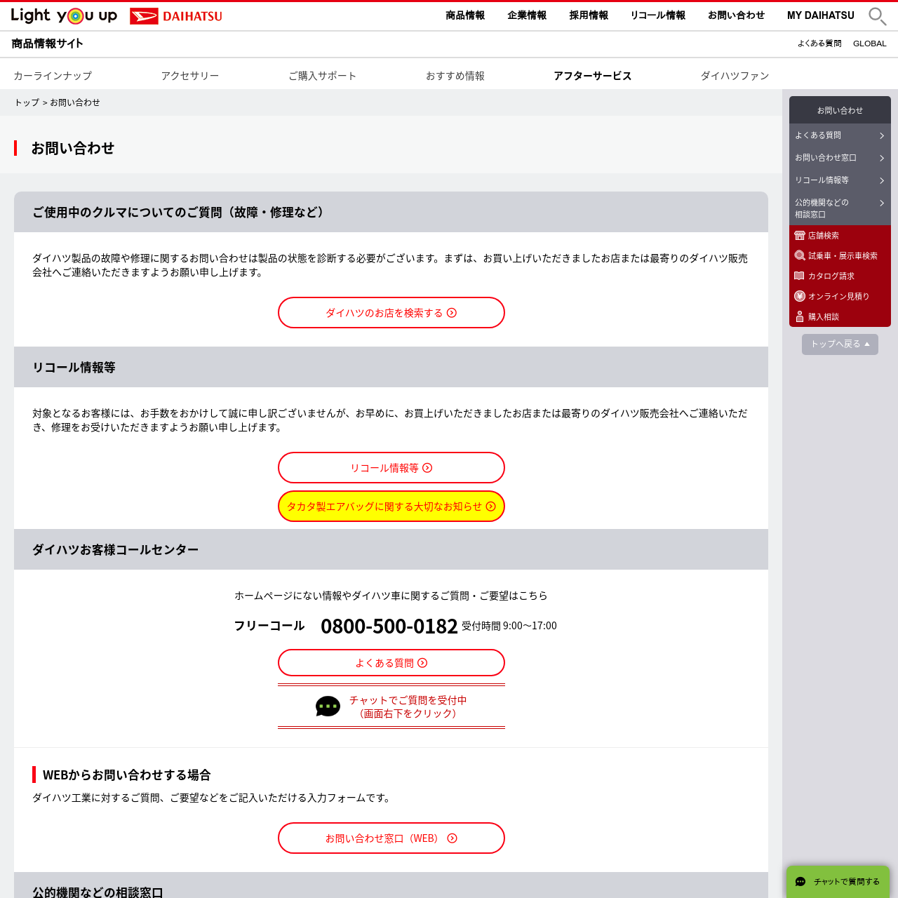
Daihatsu has a dedicated FAQ page (よくある質問) and a separate Contact Us (お問い合わせ) page. Compare Vauxhall’s ‘Contact Us’ page below with Daihatsu’s very detailed ‘Contact Us’ page above, which lists a phone number, and has the options for a live chat or writing a message. From this comparison, we can see how Japanese companies put a lot of attention to their Customer Service options.

Want to learn about how Japan’s changing demographic landscape has affected its consumer groups? Click here.
2. Update Your Profile to Create Legitimacy and Trust
Some of our clients come to us feeling that they are getting no interaction with other Japanese companies or partners and wish to understand why. We usually find that it’s because their website, from a Japanese standpoint, lacks a sense of legitimacy. Japanese companies and consumers are more likely to be warier of international businesses and websites as they are cautious of scams.
To boost the legitimacy of your Japanese website, create a ‘Company Profile (会社概要)’ page. This is like an ‘About Us’ section, but make sure to feature some facts and figures about the company (such as the year it was founded and by whom; employee numbers, etc.). This creates a sense of trust as Japanese websites usually feature this information. Japanese websites also usually feature a message from the CEO.
These messages are not usually a write-up of the CEO’s credentials, but rather a friendly hello on behalf of the company that addresses its valued customers and stakeholders. CEO messages are likely to mention current affairs topics too – most recently, the pandemic for example, where they can take a chance to extend their well-wishes to everyone.
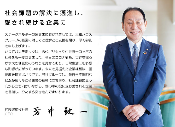
Above: Example of a ‘message from the CEO’ (社長メッセージ)
Another great way to position yourself as a trustworthy website is by placing testimonials from global companies (and if possible, from Japanese clients) on your website. Japanese consumers or partners will feel more comfortable if they spot a familiar company in your testimonials. Moreover, some Japanese companies are aware that there can be difficulties in working with foreign companies due to cultural and language barriers. With a testimonial from a Japanese company, you are underscoring that you have past successful experiences doing business in the japan market, and therefore understand how to work together successfully and respectfully. Presenting your company as authentic and reliable is the first step in building trust with your Japanese audience.
Want to learn about innovative Japanese companies? Click here.
3. Consider Sidebars Over Headers
When we give our clients feedback to change the layout of their Japanese website, sometimes they can be reluctant. We understand that businesses feel very protective of their company’s web design – but the aim of changing the layout is to build a sense of familiarity and relevance for the Japanese consumer.
As Japanese can be read from top to bottom, Japanese websites prefer to use sidebars (placed vertifically on the left) instead of headers (placed horizontally on the top). This is purely because, from a Japanese person’s point of view, it is easier to read and navigate. Compare Shiseido’s English and Japanese websites below for reference:
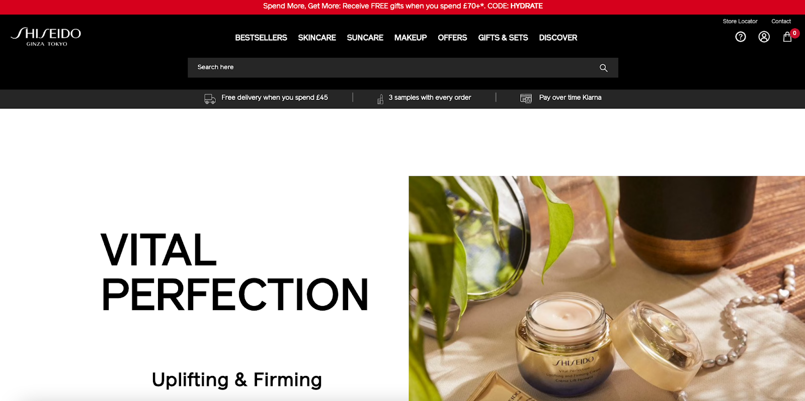

Note the search bar at the bottom left-hand corner.
One thing we recommend is checking out what your Japanese competitor’s website looks like and studying their layout. Look for how they organise information on their site. What does the flow look like? Remember that industry-by-industry there can be differences in how businesses portray themselves.
Don’t forget that the priority for your Japanese website is to create a familiar and comfortable experience for the Japanese audience. This will in turn enable users to keep scrolling to the information that is most relevant to them, getting those conversions that you are seeking.
4. Double-Check Your Text Formatting and Fonts
Just because you have got someone to translate your text into Japanese, it’s not over yet! One thing that some businesses forget to consider is basic formatting, and this is crucial, as bad formatting can undermine the legitimacy of your website.
Whilst there are spaces between words in English, this is not the case in Japanese. This means that you need to be careful where you split the line in a paragraph. For example, there is no space between ‘マーケットリサ ーチエージェンシー’ (which means ‘Market Research Agency’), and yet, this line should not be abruptly cut or else it does not read smoothly; this runs the risk of making your website look strange at best, and dubious at worst.
Some of these tips may seem simple and even obvious. In actuality, however, we very frequently see this mistake on our clients’ websites. It’s a telltale sign that although the site was translated, a native speaker was not involved in the subsequent localization of the site, or has not been involved in updates.
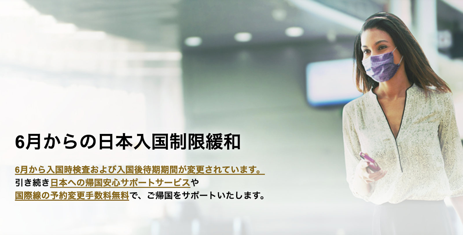
The text format from JAL’s Japanese webpage is a great example. Note how the first line ends on a full stop, but the second line ends on や (which in this instance, translates to ‘and/or’). To any Japanese speaker, this reads very smoothly.
Also, you may think that the font you have chosen for your Japanese website looks great, but make sure to test it out on a Japanese audience first. The font you chose might not match the message of your website – as in English, some fonts are more appropriate for business, whilst others are more creative. (What if that aesthetically pleasing font is the Japanese equivalent of the controversial Comic Sans?)
And so, even if your translation is perfect, it is important to have a native Japanese speaker check the format and fonts of your website, to make sure that it does not look unnatural.
5. Don’t Fall Into the ‘Cherry Blossom’ Trap
We have also noticed that some foreign companies fall into the trap of over-Japanifying their Japanese website by using typically cliched Japanese visuals, like cherry blossoms and samurai/ninja-related motifs. Of course, there is absolutely nothing wrong in featuring these images if they relate directly to your products or service, but if you are only using these images to create a sense of familiarity and relevance, be aware that there are many intricate unspoken codes that are easy to get wrong. You need to understand the exact nuance of these visuals.
For example, Jo Malone has very successfully integrated their products into the Japanese market. Their website is localized and works well for the Japanese audience. For their ‘Sakura Cherry Blossom’ cologne, they did not fall into the trap of overdoing it with the cherry blossom motifs: the images are clean, not cliched, and the cologne itself stands at centre-stage, framed by the cherry blossom.
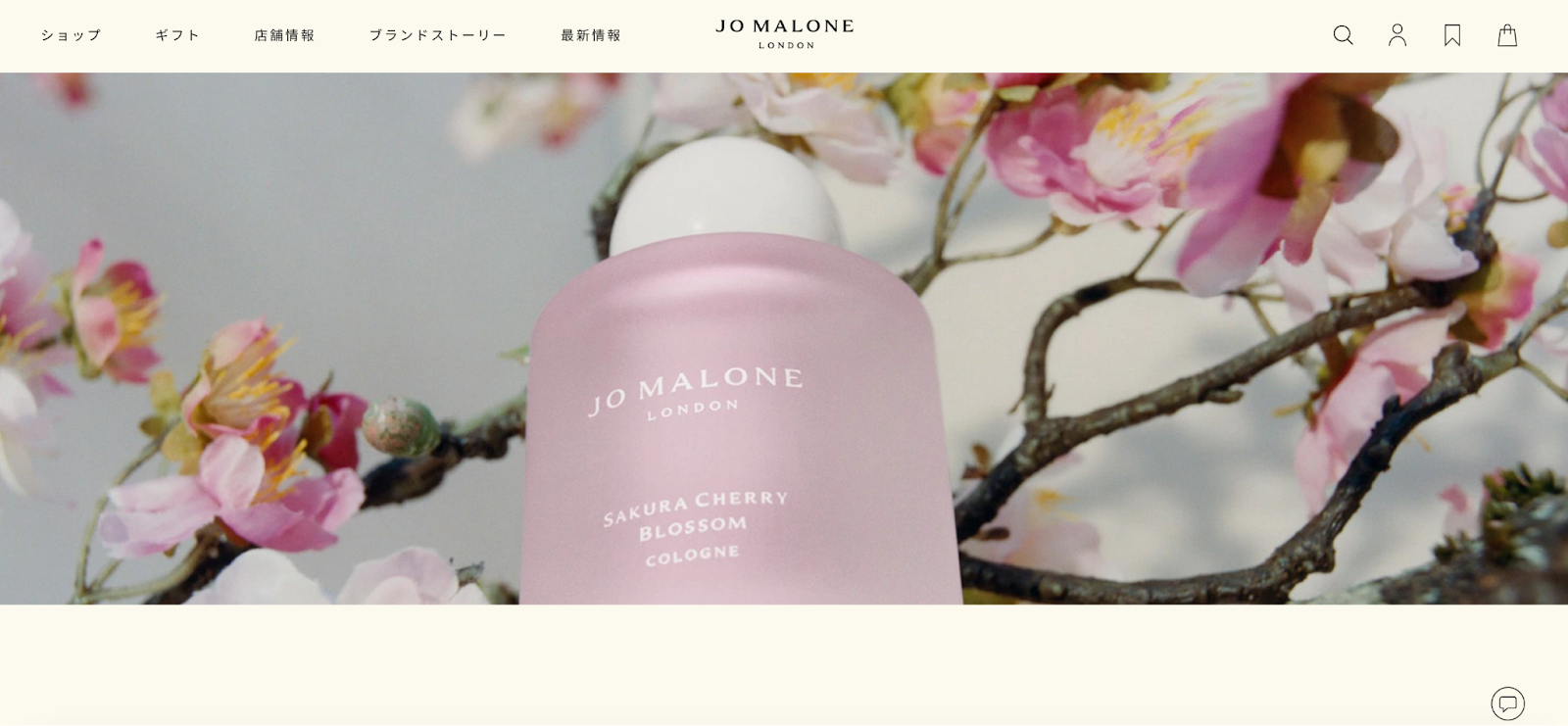
Be mindful of the Japanese visuals you use, and don’t try to force them in if they don’t relate directly to your product or service.
6. Don’t Just Translate – Localize!
When we suggest localizing a website, some clients are quick to tell us that they feel there is no need for it, as they already had a freelancer translate their website already. However, this can be a problem, as a literal translation does not take into consideration how the audience needs to be communicated to. Simply translating a website, unfortunately, is not enough. A direct translation into Japanese can easily neglect certain nuances and you could run into some visual and verbal faux-pas too, making your website feel unnatural. A native Japanese speaker is likely to notice these very slight differences. This is especially true due to the detail-orientated nature of Japanese culture.
For example, Tylenol failed to penetrate the Japanese market because they did not change their packaging colour from red (standard US painkiller packaging colour) to blue (standard Japanese painkiller packaging colour). They translated, but did not localize. The brand did much better when their packaging added elements of blue, which successfully signal to the Japanese consumer the category of the product.
In this way, a pure translation could ignore Japanese website layouts and design features. Japanese websites are very text-heavy and brimming with information. This is because Japanese consumers typically need more time to consider a product before purchasing, and so, Japanese websites often detail as much information as possible to help with the customer journey. It is actually a form of Japanese hospitality to provide all of this information – to make it as easy as possible for a customer to obtain the information they need in their hunt for a product that suits them. This means that even if your English website is committed to a more simplistic aesthetic, with few words and a lot of high-quality pictures, it is important to understand that you will need to add more text and information for your Japanese website.
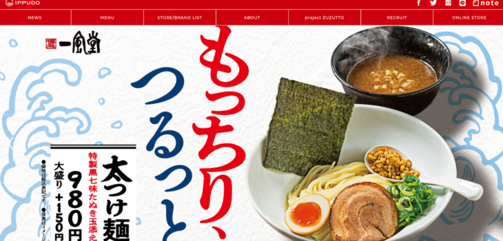
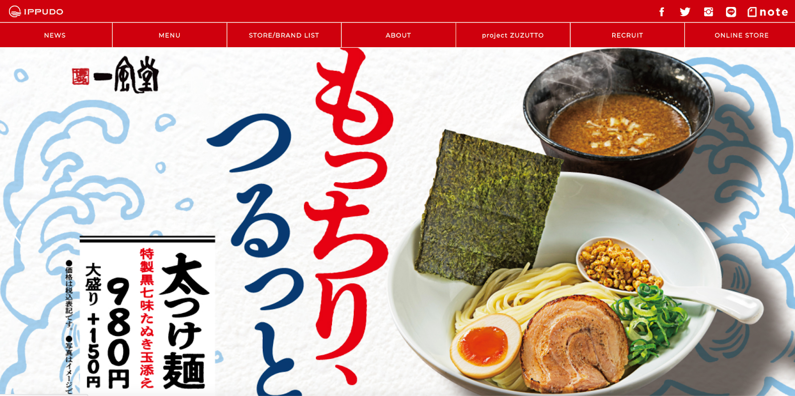
For example, Ippudo is a Japanese ramen company that has recently expanded into the UK market. Look at the images below and see how Ippudo’s Japanese website and English website are visually very different. They have localized their English website very well, to the tastes of the British audience.
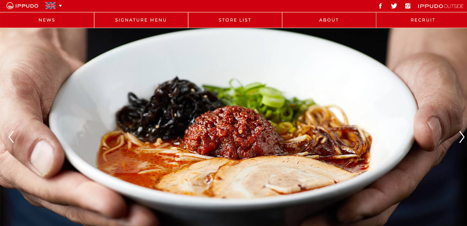

As such, remember although many businesses stop at the ‘translation’ stage, in order to really create an impactful website for Japanese audiences, it is essential that you continue your journey onto the ‘localization’ stage. This will be much more effective, as it considers not only the language but the main web design and the trends of the market and your target audience.
So, I need a Japanese website for my business… What do I do now?
Firstly, scope out your landing page and determine what will immediately need to be changed. You could look at the layout of your website and how information is dispersed. Spot what’s missing too (do you have an in-depth ‘About Us’ page? How’s your Customer Service page looking?). Then, conduct a translation vs. localization analysis. Examine what language and visuals your Japanese competitors use. This is where SEO optimization tactics tailored for the Japanese market will also be impactful. Get a Japanese native speaker to check your tone, formatting and fonts.
And remember: just because someone is a native speaker does not mean they are definitively qualified to judge your website. We all know this intuitively. Rarely would we 100% trust the opinion of one person for our businesses in English – so we shouldn’t don’t do it in Japanese, either! For that, you need to gauge multiple people’s responses to your site; and ideally use a team of Japanese market specialists to get it translated and localized, rather than a single freelancer. Once you have all this in place, you can finally update the design and content of your Japanese website.
If you require any assistance along the way, Tokyoesque can help you at any stage! We have enabled many clients from varying sectors to translate and localize their website successfully into Japanese.
Interested in creating a Japanese website for your company? Tokyoesque can help you! Get in touch with us to discuss how we can help you localize your website into Japanese.
Keep checking back or follow us on LinkedIn to get notified about our latest posts. We’ll be adding more articles on technology developments and various sectors in Japan, so watch this space!

